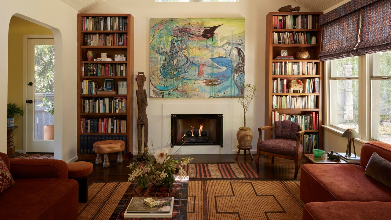
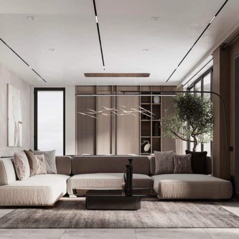
Every interior designer has their own creative process, but most would agree that styling surfaces in a home is their signature finishing touch to tie the whole project together. The presence of beloved objects and books gives a space lived-in character that can’t be achieved with beautiful furniture alone. And the intentional arrangement of such items is the difference between clutter and decor.
To help you get it right, we spoke with five members of the AD PRO Directory about their best tips for styling surfaces throughout your home. From telling a color story and playing with scale to embracing negative space and keeping it simple, these ideas will allow you to create designer-worthy vignettes on your own. Keep scrolling for their expert advice.
1. Tell a color story
For Casey Howard of Danville, California-based studio Casey Howard Interior Design, the key to a well-styled surface is telling a color story with your objects. That means “combining like colors together and considering how color placement flows across shelves.” Each vignette should have a curated palette and speak to the tones of the other vignettes in the space.
2. Play with scale and height
According to Garance Rousseau of Maison Garance in Los Angeles, “playing with scale and height allows [you] to create visually captivating compositions” on a shelf. She recommends juxtaposing tall with short, big with small, thick with thin. Howard agrees, noting that “utilizing a variety of heights creates movement to draw your eye around the space.” Rousseau also suggests using “odd number groupings, [which] are seen as more modern and interesting to the eye than even number groupings.”
3. Embrace negative space
When styling floating, free-standing, or built-in shelves, the negative space is just as important as the items themselves, says Molly Torres Portnof of Date Interiors in Brooklyn, New York. “My biggest tip is to consider negative space, or the ‘blank space,’ as much as, if not more than, positive space,” she explains. “Negative space allows the decor, books, vases, and artwork room to breathe.”


