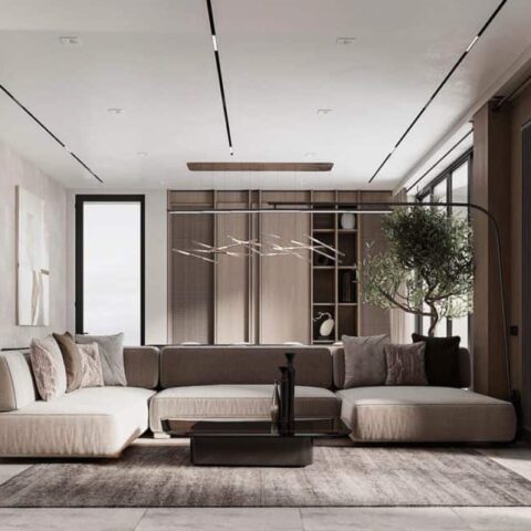
“It’s a city base for a small family from Aix-en-Provence whose father often has to travel to Paris. He’s a connoisseur and aesthete who’s passionate about architecture,” says architect Céline Boclaud. “He wanted a highly functional space where he could sleep and cook and that also had a real bathroom: an apartment with the feel of a hotel suite with room for all the essentials” The client’s first request: Don’t overwhelm the space with too many different materials. Wood was used for the parquet flooring and kitchen cabinets, polished concrete for the bathroom, and white lacquer for a large wood installation. An off-white was used for the walls while the beams were painted with a pure white that managed to make the ceiling feel lighter. But, first, let’s step back and start from the beginning with the new floor plan created by Céline Boclaud and Maureen Doux of Boclaud Architecture.
In this small apartment which is oriented around the two tall windows on one wall, the challenge was, as is often the case, to figure out where to place the bedroom in relation to the living area while taking advantage of the natural light. The architects also had to decide how much they wanted to partition the space or opt for a more open plan. The designers decided to use one window for the sleeping area and another for the living space. The bedroom is not open but instead partly enclosed by a large, multi-functional unit that incorporates a desk, a pull-out bed, a space for a TV, a refrigerator, a washing machine, a dishwasher, and access to a bathroom through a hidden, almost speakeasy-like entrance that blends into the geometric lines of the divider. The custom piece creates a smooth transition between the living area and the bedroom, while preserving the view to the second window, in the sleeping area, helping to enhance the sense of space.


