This compact apartment is located in a residential and family-friendly part of Paris’s 14th arrondissement, the Left Bank area that is home to Montparnasse and long the haunt of many artists. “The owners have a home on the same block and now with their five children all grown, they were feeling a bit lonely,” explains interior designer Léo Schlumberger, to whom the owners entrusted the renovation of the space. “They bought this space with the plan of renting it to people visiting Paris for extended periods to work. The goal was to create a tasteful and comfortable apartment, not a mere weekend rental.” Before his redesign, it consisted of a garage in front and a former caretaker’s residence (later converted into an office) in the back, with partitions and drop ceilings.
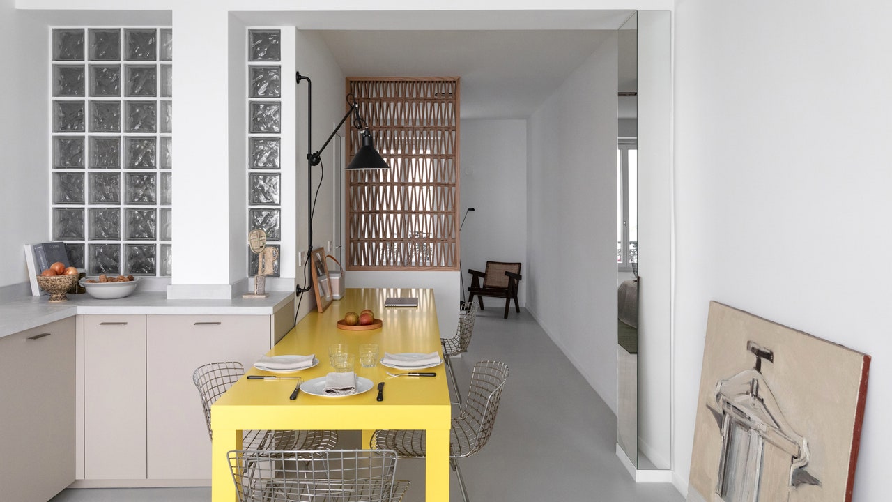
Stripped down to its basic layout, the architect had an uncomplicated cube to work with so the first priority was to provide the space with a clear organization. Léo also wanted to create a space that felt bright, with natural light entering the living area from the street through a large window created by the artist Marion de Rouvray, and, in the back of the apartment, from the courtyard—the main source of natural light to the bedroom and the bathroom, which appears like a lantern, made of glass blocks and sitting between the living area and the bedroom.
First, however, the space had to be cleared out and Léo removed a wall that ran through the middle of the space, retaining only its load-bearing posts and then creating an inverted C-plan that is remarkably different from its previous layout as a basic rectangular box. He doubled the number of beams so that they would perfectly align with the walls and the glass blocks of the bathroom. “I worked with what was there, and I like it when there are constraints. You don’t always get to work with 16-foot-high ceilings and spectacular views. Here, it’s a more basic project, with challenges like assuring the unit gets enough light and that it has some privacy given its ground-floor location on the street,” Léo explains.
Within this neutral envelope, he created strong elements, introducing colorful touches and textiles that provide a sense of warmth. Since Léo believes that “just because you have a small space doesn’t mean everything in it has to be small,” he designed a comfortably sized shower, as well as a 10-foot-long table which can accommodate four people, eating or working, when it is placed against the wall. When it is moved into the center of the space, up to 10 people can be seated around it. Next, a wall of glass blocks separates the bathroom from the living area while a terracotta screen provides privacy to the bedroom, at the rear of the apartment. There are also mirror-clad columns that are impossible to miss: “I always try to highlight the structural elements,” Léo explains with a smile.


