“At first, they did not want to spend a lot of money,” Yana explains. “They had said it should be like IKEA style, very simple. But after they got involved in the process, they became open to spending more than they expected before.”
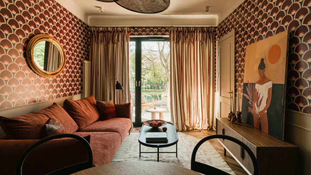
This flexibility on the financial constraints allowed Yana to accomplish the clients’ aesthetic and functional goals. She opted for a midcentury-inspired look with a warm, bold palette of reds and pinks. “I saturated the interior with thick, intense colors to create a special retro vibe that makes you feel like uncorking a bottle of wine and relaxing after a long drive,” she describes.
Yana’s most daring design choice, however, was her liberal use of graphic patterns. It begins in the little foyer, where an arched doorway is paired with black-and-white polka-dot tiles. “I always try to make an impression at the entrance,” she explains. “I like to create some playful space. When you come inside of the apartment, I like to make a wow effect.”
Herringbone walnut floors lead into the open living-dining-kitchen area, which is covered in a shock of burgundy fan wallpaper. The vivid, geometric print is balanced out by the black Shaker-style cabinetry and the ivory picture frame molding that Yana installed for architectural charm. She furnished the eating zone with bentwood bistro chairs and a flower-like pendant, then outfitted the lounging section with a rose-hued velvet sofa and a vintage gilded mirror.

