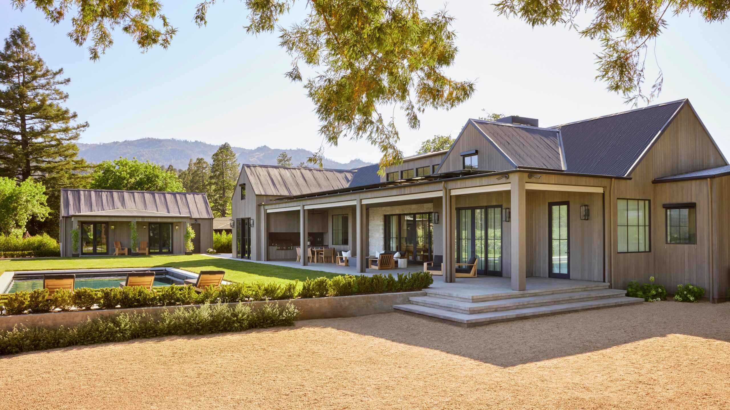
AD PRO Directory designer Lindsay Gerber was busy renovating the 115-year-old farmhouse she and her husband purchased, having left San Francisco during the early onset of the pandemic, when she heard from a potential client. The homeowner was eagerly following Gerber’s transformation on Instagram, and, coincidentally, she, her husband, and their two young boys were also leaving the city for the country. Unlike Gerber’s farmhouse, though, this was a teardown—decidedly not an historic renovation. Despite the promise of the piece of property, located on perhaps the most coveted road in St. Helena, California, with stirring, agrarian views in all directions, the modern farmhouse concept was, for Gerber, a nonstarter. “I was like, ‘Thanks, but no. I think that style has been overdone.’ She was like, ‘Lindsay, you can make it great!’”
So Gerber deliberated on the proposal, and on the parallels between her own young family’s abode and this new prospect. “I realized there were these through lines,” she shares, between her “sweet, old, boxy, white three-story farmhouse with a water tower,” and the potential client’s new build. “Maybe my one mission with this is taking their modern farmhouse and to contextualize it in a way that makes it less cliche and, hopefully, more enduring. So, I took the job.”
Her first order of business was a brainstorm with local architect Joseph Farrell, who specializes in large-scale modern farmhouses. She peppered him with questions: “Can we create a narrative around this house? What would this house have been, if it were built 100 years ago?” They decided to “wrap the inner box of [the house] with stone, and the story is that it started with a stone great room, with more modern appendages that grow off of it.” Inspiration came, too, from her own concurrent renovation. “Even as we were designing the windows and trims, I’d snap a photo for [the homeowner]: ‘Can we pull this idea in there?’”
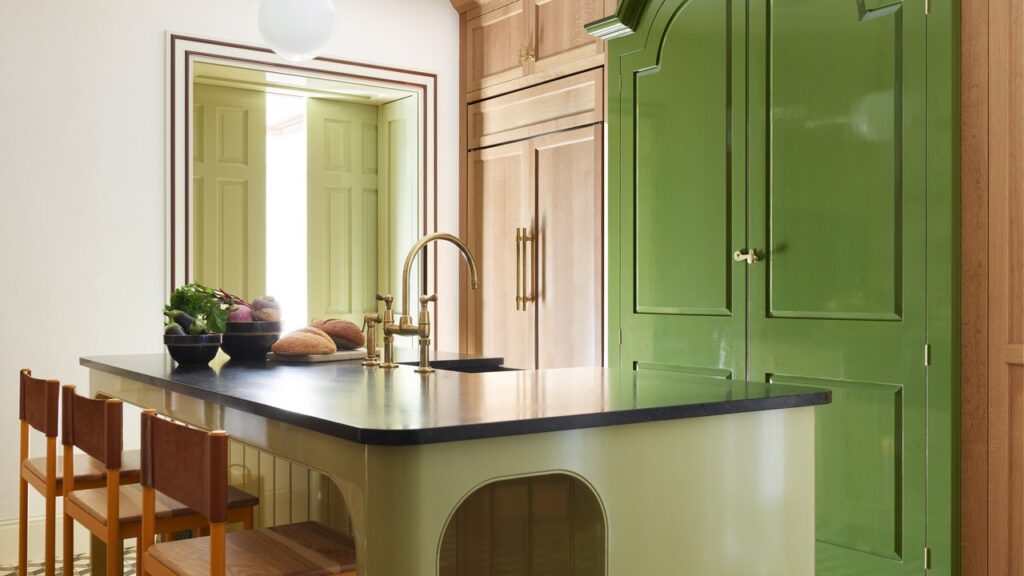
Adding decorative layers to the new home also involved tackling creative conversations, and differences, with the homeowners. The wife “is really elegant and very tailored,” says Gerber. “I wanted to bring dirt in and rub it on the walls. It was always this back and forth of her wanting everything to feel crisp and perfect, and me being like, ‘This is the country. We need to bring some earthiness!’” In the poolhouse bath, the two forged a happy middle ground, with Gerber’s rustic cobblestone floor choice as a concession for the homeowner’s chic glossy-finish paint on the walls. The trend repeated in the pantry: “Give me rough, old, marble floors—but put them in a checked pattern. And we’ll make all of the cabinets super glossy,” she recalls of their collaboration.
Distinctly tactile textures like suede, leather, and nubby wool, rendered in pleasing neutrals, pad the family respite at every turn, while statement spaces, like a moody powder room wrapped in a landscape-inspired mural by Caroline Lizarraga, find harmony with sweeping, generous rooms, like the kitchen clad in Benjamin Moore’s traditional go-to hue, Simply White. Inspired by the tension between the polished and the rustic, the picture-perfect and the well-worn, Gerber found that much of her role as designer was “giving [them] permission to let this be more comfortable, not every pillow karate-chopped,” she reflects. “I came in and tried to ruffle it up. We found a nice balance.”


