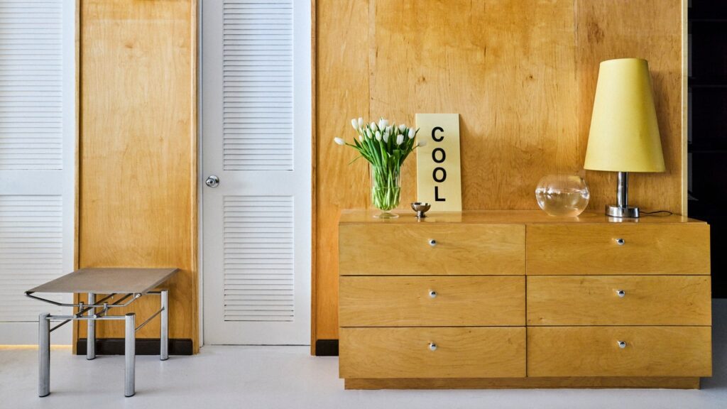
Last summer while I was in Copenhagen, I began noticing chrome design details everywhere I turned. In a city that boasts color and playful aesthetics (the tentpoles of Scandi style), seeing subtle pops of chrome felt out of place, yet the duality presented the metal in a way that felt softer than I had ever previously witnessed. The warmth of the colors soaked up some of the harshness of the metal. A pink sink with a chrome faucet sat like a sculpture in Rosy Vintage, stainless-steel shelves displayed A.kjærbede sunglasses at their flagship, and more cafés than I could count paired classic Danish design details with chunky stainless steel tables or funky chrome stools.
I returned to Miami with the urge to brighten up my space with splashes of chrome. Soon, it would become clear though, that it wasn’t just me having a moment, but a full-on movement was underway as industrial minimalism quietly made its comeback. In August 2023, an email from Staud landed in my inbox declaring that a “chrome renaissance” was upon us. Olivia Rodrigo’s cord necklace in her “bad idea right” music video unleashed the internet into a frenzy over the trend, trading in bright beaded jewelry for bold stone or silver pendants. On a trip to my parent’s house in Connecticut, I resurfaced my Tiffany & Co. Elsa Peretti sterling-silver bean necklace that I hadn’t touched since high school, and convinced my parents to pass down their sterling-silver Alessi pepper grinder and expandable trivet, which were originally gifts from their wedding.
But what if you actually do want to take chrome design beyond accessories in a way that feels less like participating in a trend and more like a timeless vignette in your home? What if you want that moment to feel warm and inviting rather than cold and sterile? From homeowners and interior designers to the brand behind those sleek metal shelves on everyone’s moodboard, I took these questions to five people who find peace of mind in metals to gather tangible tips and approachable answers once and for all.
Play with color
Victoria Ashley, the founder behind Laundry Day, a line of contemporary cannabis accessories and home objects, has an affinity towards mixing chrome with bright industrial colors (see her ashtray collaboration with Alvaro Ucha Rodriguez for proof). On the FRAMA shelves inside her Barcelona apartment, Victoria mixes “a lot of art books and objects that are in the fluorescent orange that you may see at an airport, or just different, very bright striking colors.” From her POV, chrome “allows your mind to visually jump around, where I think if everything was steel in one tone, it would fall quite flat.” Paulina Melinauskaite, global PR and brand activation specialist at FRAMA, fully agrees with this sentiment. “On one of our Rivet collection units, the burnt orange wheels give this more approachable and more youthful touch.” On the subject of the stainless steel shelves, Paulina suggests adding “meaningful and very warm-to-the-soul, colorful accessories. Be it favorite books, a vase or a pot with flowers, something more organic and livable.”
Layer on the textures
Victoria stands by adding in softer textiles, with items like her vintage Ligne Roset sofa in a crushed cream velvet and a camel leather chair with a stainless steel frame. From Paulina’s perspective, the texture that rugs add has the ability to, depending on your intention, “unite the space or separate the space.” As she further explains, “a rug under a long table sums it up and brings everything together. A rug under a chrome coffee table, next to a couch, or beside a beautiful armchair, has the ability to create a separation of materials.”

