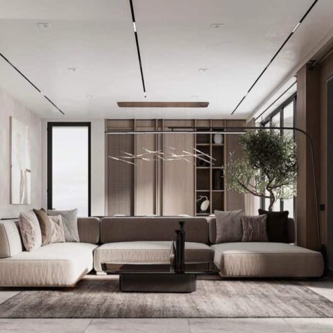
“It’s a manifestation of our purpose,” Lalonde says. “We design for a beautiful life. We want to beautify the world. At home, outside in public spaces, hotels, retail—that’s our mission. I’m very moved by how we’re able to capture the essence of our purpose in this space.”
The showroom feels effortless, but the need to give space and light to half a dozen major brands, each with its own identity and legacy, posed a few unique challenges. “There were a lot of conversations,” Lalonde says with a laugh. “It was important for me to steer the ship, but I asked Piero to design something that would be a solution so that each brand would feel they can express themselves. We didn’t want to merge the stores, but to interlock them.”
Lissoni points to the mesh material as a way to make the brands, well, mesh. “The semi-transparent walls divide the space,” he shares, “and establish a certain fluidity, allowing the brands to dialog with each other while maintaining their individual identities.”
Lalonde agrees. “It’s not an easy exercise,” he says, “but it’s a beautiful exercise. When you get it right, I feel so happy. I don’t think there’s anything like it in our industry.” Until now.


