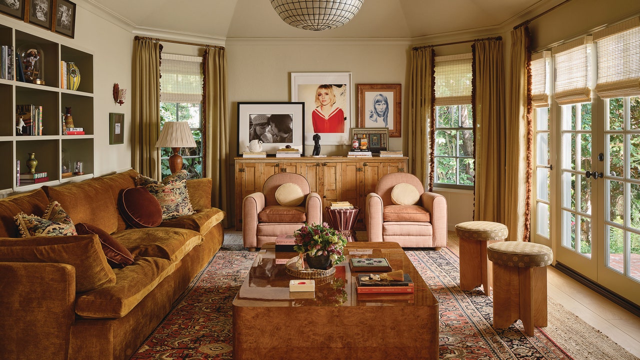
AD’s newest cover star, Emma Roberts, first fell for her Los Angeles abode when she glimpsed the cabinetry in its living room—the generous millwork was perfect for the bibliophile’s extensive book collection. “In her old house, we had to build shelving, but in this house, there were already so many bookshelves,” says Emily Ward of AD100 firm Pierce & Ward. Thanks to quite a few such selling points, the residence did not require a full gut renovation but rather inspired the designers to make a series of clever design moves to tailor the space for their starry client. Here, Ward breaks down several of the key sourcing decisions behind the May cover story of AD—read on for an inside look at how the space came together.
Off-White Paint
When Roberts enlisted Ward and her business partner Louisa Pierce to design her new home, all parties agreed that the existing color scheme was simply too many shades of white. That said, the designers wanted the space to still feel light and fresh, so they installed Benjamin Moore’s Manchester Tan paint throughout the home to make it feel more cohesive. Although Roberts was away filming at the time they landed on the color, she shared an immediate affection for the hue. “We were able to go, ‘I know this sample looks dark against the white [in here], but here it is [shown] in another house. And she said, ‘I love it,’” elaborates Ward.
Bonus Tip: If Pierce & Ward want to add layers of depth to a room, they will paint the window mullions their own unique color. In this case, they went with Cos Cob Stonewall, a “deep, dusty blue” from Benjamin Moore, as evidenced in the living room.
Window Coverings Worth the Splurge
According to Ward, the biggest line item in a decorating budget should be window coverings: “They are so important and instantly add layers to a home.” Pierce & Ward picked woven wood shades from Hunter Douglas for the foundational window treatments throughout the home. “We love bamboo because it lets the light filter through, and it adds an earthy element,” Ward says of their selected coverings, which also incorporate wood, reeds, and grasses. “You can leave them down all the time for privacy, but you can still see out.”
A Budget-Friendly Kitchen Island
Initially Roberts thought her kitchen was too petite to accommodate a kitchen island, but Pierce & Ward won her over with a compact off-the-shelf model from none other than Urban Outfitters. “She couldn’t believe how it changed the space. Sometimes people think furniture will make a space feel smaller, but it can actually make it feel bigger.” And no matter the size of the room, Ward points out that at some point in the day, everyone ends up hanging out in the kitchen: “It’s so nice to have somewhere to sit and to turn around and put something down behind you when you’re cooking.”


