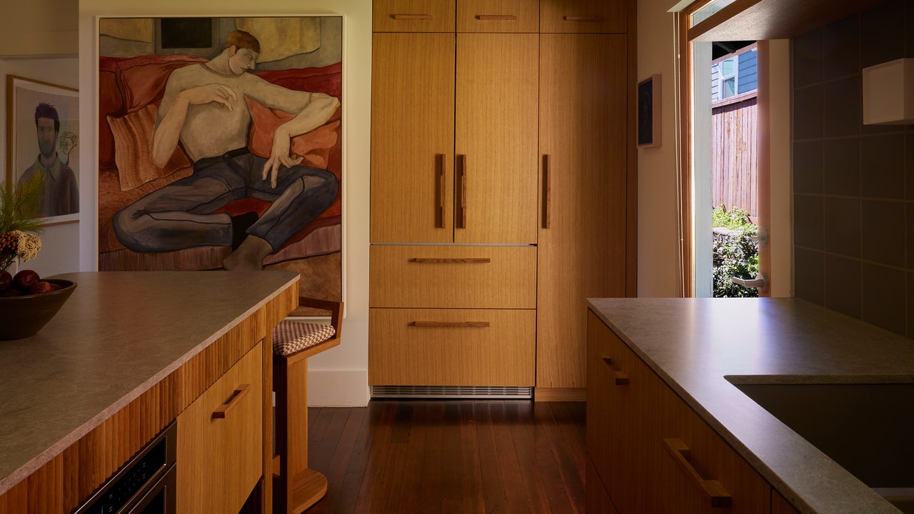
The couple asked that their renovation feel “contemporary and clean-lined” but requested that the original Douglas fir flooring remain. They agreed that an island was needed for everyday meals and casual hosting, and suggested that the doors leading outside didn’t take up as much square footage. So as the partial wall separating the refrigerator from the oven was removed, and the French doors were replaced with a single frame, the contractor took their goal of simple geometry rather literally.
“The main issue with any home that’s over a hundred years old is framing: What’s original is likely not going to be plum,” Patrick says. “In designing a more modern kitchen, this proved to be difficult in a few areas, especially where we integrated the fridge beside the new door.”
The updated design positioned the island as a focal point, with seating on one end and storage on the two longest sides. The refrigerator stood in the corner by the door outside, facing an L-shaped block of cabinetry that had open shelving above the sink and glass cabinetry on the far wall. An oven was set in its own nook on the third wall, and the entire room was unified by sage green square tiles and white oak from top to bottom.
“The decision to use white oak was reached for two reasons,” Patrick says. “One, to fulfill the contemporary style they were after, and to not darken an already tucked-away space. The kitchen can be quite shaded at different times of day, and with the floors already being so rich, the white oak adds some brightness.”
Of course, no one disagreed that this kitchen had a lot of wood, which is why they devised a handful of details to provide some much-needed layers. Johnny and Josh came up with the idea to accent the island in fluting, while the pros installed cross-reeded panels on the glass cabinets to complement the grid of the backsplash and pendant above the island. “The square-grid motif was also the reason why we decided to have coordinating white oak pulls for the millwork,” Patrick adds. “From certain angles, the wooden pulls create an almost morse-code pattern, peppering the length of cabinetry.” Heck, even the upholstered fabric of the island’s seating has a grid.


