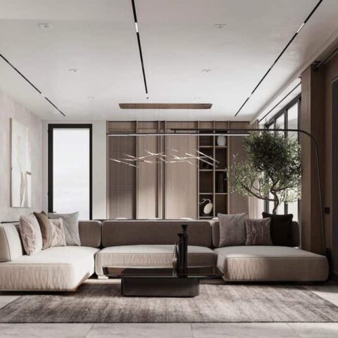
Despite the hubbub, the vibe is relaxed and inviting in the living room, which comprises a sitting area and a desk zone. Original features like high ceilings and decorative moldings give the space historical character, while neutral-toned plaster walls add coziness and texture. “My rule is I don’t like white paint,” shares Sebastian. “I wanted it to feel warm and charming, and I thought layering it with matte plaster would really bring that.”
Sebastian also refinished the wood floors with a darker stain. “They were this super high-gloss cherry kind of wood—horrifying,” he remembers. “I thought the dark floors give that energy of seriousness. If this is a place I’m bringing clients to, I want it to feel refined. And also it’s an office. I want it to feel like there is some sort of order when you walk in. It looks like an atelier, not an apartment.”
Once these light-touch yet impactful updates were made, Sebastian furnished the room with collectible items, many of which are on loan from vendors and available for his clients to purchase. A 1930s forest green André Arbus rug from Beauvais, for example, currently sits atop his sisal rug for an upcoming project; an aluminum Jean Prouvé wall panel that belongs to Raisonné hangs above his velvet sofa. “Instead of taking our clients to galleries, we show them how pieces look in a residential space,” he explains.
Other treasures, like the 1950s French armchairs and the midcentury Gino Sarfatti floor lamp, are Sebastian’s own investments. And when he couldn’t afford to splurge, he got creative: He framed a limited edition Ed Ruscha silk scarf from Gagosian and hung it up. “We’re not printing fake art here,” he explains. “That is super cheesy. It’s not who we are. But there was a series of a thousand scarves, so I thought that would be special and fun.”


