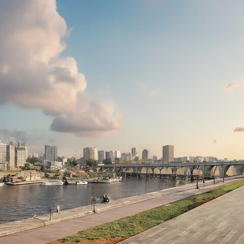
In the northern Mexican state of Nuevo Leon, the Sierra Madre mountains form a dramatic backdrop to the city of Monterrey, which lies some 100 miles west of the Texas border. The region is an economic powerhouse in the country, and a place where contemporary art museums and galleries are as much an attraction as the cobblestone streets and 18th-century mansions of its historic district.
In the Monterrey’s affluent San Pedro Garza García suburb, Mauricio Lobeira, co-founder of the Dallas-based AD PRO Directory design firm Ten Plus Three, decided to build a home from the ground up with his partner, Mauricio de la Garza, himself the founder and head designer of Dornato, a landscape design firm. (Lobeira splits his time between Mexico and Texas.)
“I had in my mind that I would either build a house or buy an apartment in Monterrey,” says Lobeira. “When scouting for options, I came across the perfect land lot tucked into a quiet residential zone. It neighbors a park offering abundant trees that create the perfect oasis from the nearby streets and has a pathway right next to a stream.” This stream, in fact, generates a microclimate that would eventually be useful in creating a verdant garden that now surrounds the house.
Although it was an oddly shaped piece of land, according to Lobeira, with its irregular and sloped terrain, the architect was excited by the challenge, and this being a new build, “I had complete creative freedom to do as I pleased, and turn it into a home,” he says.
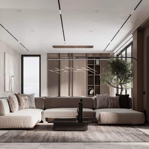
The house, which was finished in 18 months, contains all the elements Lobeira and de la Garza envisioned, chief among them a great room that encompasses a living room, a bar, the dining room, and the stairway that leads to the bedrooms. “The entirety of the space is connected by a wood ceiling, and the only division is a singular floating wall. This wall was added to keep the visitors from seeing the full space upon first glance, and to leave some surprise and ‘wow factor’ when walking around it,” Lobeira says. He also wanted to optimize every inch of the house, and accomplished this by designing a floor plan without a single hallway, so that each square foot could potentially be used in some way, with no dead space.
“In terms of feeling, I wanted a very warm and familiar atmosphere,.” Lobeira adds. Hardwood floors, wood ceilings, and textured fabrics do the trick, along with contrasting materials. The sharpness of a bronze mirror or the hard steel rail of the stairway, for example, gives the house a refined yet decidedly modern look.
In the bedrooms, the vaulted ceilings offer a sense of spaciousness, and the massive windows open up to the surrounding garden and tree canopy, inviting the outdoors in. “In the bathrooms, I wanted to use as much natural and bright light as possible, so I added skylights and windows,” the designer says.
Lobeira was inspired by the nature of the materials—the warmth of the wood, the strength of the stone facade, along with the steel and glass that he designed to all work together as a whole. As far as his favorite spots in his new creation, the dining room and bedroom are the first that come to mind. “I guess it’s because both spaces are surrounded by massive windows that let the greenery inside, and this creates an immediate impact on my state of mind,” he says. “The warmth and serenity that we feel in every room, and the amount of light and plant life that we get through those windows is a true reward.”


