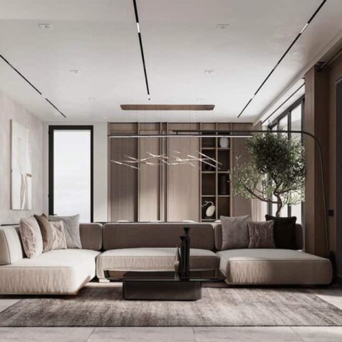
After Crowell found an office space per recommendations from friends in the same building, she needed a reliable firm to not only tackle the task at hand, but someone who could seamlessly execute the brand’s core messaging into every design decision. So she enlisted Hyphen & Co founder Shelly Lynch-Sparks for the job. The New York–based interior designer’s resume is packed with large-scale residential and hospitality projects, standouts including Dan Abrams’s West Village town house. Lynch-Sparks was also through a friend recommendation, and the two clicked naturally and immediately got to work. The initial consultation took place in late 2023 and opened its doors to employees and guests this past September.
The 3,500-square-foot office, which sits in Tribeca on the corner of Walker and Broadway, embodies what the brand stands for: It’s clean and sleek, and the minimal interiors house eco-friendly materials and luxury vintage decor pieces. One thing that Crowell emphasized is that it’s not your average office—it serves as an inviting sanctuary, intimate and cozy enough for pop-up events and visits from friends of the brand. “I wanted the office to feel like an extension of home,” Crowell says. “We have a saying, ‘feel good, do good,’ and I wanted the office to be a place where everyone could feel that way.” Below, we highlight some of the standout features from Saie’s NYC HQ and share some tips on how to get the look for your own space.
Minimalism doesn’t have to be so sterile
Saie’s HQ channels Scandinavian minimalism, a design aesthetic that balances simplicity and comfort. Part of Crowell’s vision was to create a modern yet approachable workspace, and to ensure it was a far contrast from the usual (and outdated) sterileness typically associated with a traditional office. In order to achieve this, Lynch-Sparks opted for a predominately neutral and earthy palette to soften the space—cream-colored walls melt into warm browns of all shades and the occasional hint of moss green. The designer also introduced hints of natural elements to complement the exposed industrial structure. The lounge area, for instance, places raw and dark cuts of wood via stools and tables, but adds geometric light fixtures, thinly-sliced metal shelves, and chrome accent pieces to restore contrast.


