After nearly a decade of living in a historic building on New York’s Upper West Side, designer Melissa Lee’s clients—a family of four with two young girls—were looking for more space. The couple had moved into their apartment when the wife was pregnant with their first daughter, but nine years later, the need for more room reared its head.
“As we were going through the pandemic, we spent a lot of time working from home,” says the wife. “With two growing children, it made us wonder if we wanted to move to a larger place.”
The issue was that the family loved their building. The building was designed by architect William Rouse and constructed in 1909. Some of its units, including the one owned by Lee’s clients, have sweeping views of the Hudson River. Aside from the vistas, the building’s stately presence and prewar details had initially charmed the husband and wife. “We like old buildings,” says the latter. “They have so much more character.”
In 2022, the apartment next door went up for sale, and suddenly, the prospect of a bigger home in the same building became a reality. The seller had lived in the neighboring apartment for 30 years and never modernized it.
“There were a lot of beautiful, original details,” Lee says, noting that while she had some back and forth with the clients about whether to update the unit, ultimately, everyone landed on the same page about honoring the building’s prewar roots and retaining the inherited architectural details. “When we started to talk about merging the two, we had to think about creating a vocabulary that communicates through different eras. How do we weave them back together in a way that feels coherent?” Lee, who had previously worked with the clients on their country house, also notes that they “have a modern-leaning aesthetic and gravitate towards clean lines and Scandinavian furniture. We had to figure out how to bring that into a quintessential Upper West Side space.”
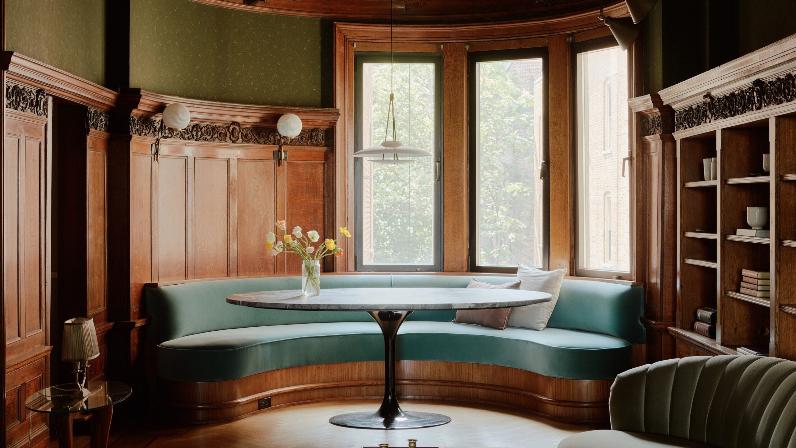
Working with architect Sarah Jacoby, Lee’s firm, Bespoke Only, did a full gut of both apartments, rearranging and removing walls to connect the separate spaces and create an easy flow between rooms. The library in the neighbor’s residence, with its original wood-clad walls and intricately carved embellishments, was a jumping-off point for the project’s aesthetic, and the enlarged kitchen became the heart of the home.
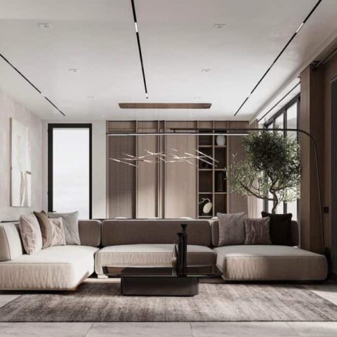
“The kitchens were back-to-back in the existing apartments,” the client says. “We made that into a large central hub. I spend a lot of time in the kitchen, and the kids do their homework or eat breakfast at the island.” For this room, Lee used light blue cabinetry (painted in Benjamin Moore’s Van Courtland Blue) and white subway tile as nods to the property’s historic roots. The kitchen has two separate “wings” with individual functionalities and utilities, and a central beverage station (covered in woodland-themed toile wallpaper from British designer Sian Zeng) ties them together. A door behind the island opens to the library, where Lee installed a custom, semicircular banquette upholstered in cerulean velvet. The living/dining area leans more modern with a mix of Scandinavian and custom furniture, but small details, such as a herringbone floor and plaster molding replicated from the neighbor’s apartment, help visually connect the newly unified spaces.
Aside from the kitchen, wallpaper also appears in the library and entry hall, bringing a rich elegance and British-inspired sensibility that the clients love. “It was a bit of a bargaining process with my husband!” the wife admits. Private areas such as the primary suite are more subdued, with neutral tones like gray, white, and tan taking precedence to create a serene escape at the end of the day.
The seamless transition from two apartments to one relied on careful attention to balance—knowing when to highlight original elements and where a preference for the modern would make a room shine. With an eye for color and texture, Lee was able to do both, capturing the elegance of a time gone by while crafting a home for contemporary life.
“We wanted our space to feel peaceful and warm,” says the client. “When you live in the hustle and bustle of a place like Manhattan, it’s nice to have a calm, inviting home.”


