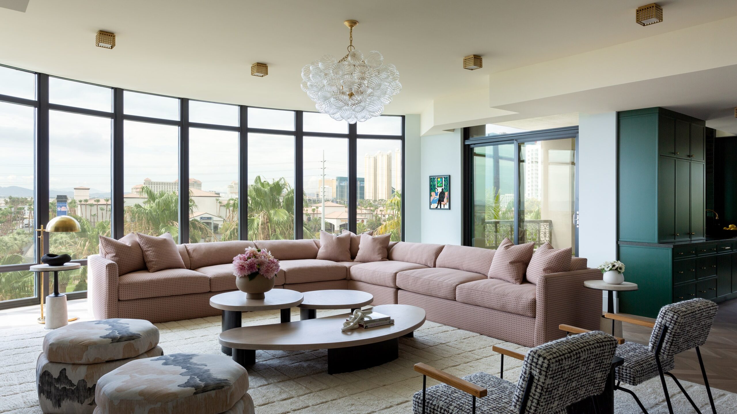
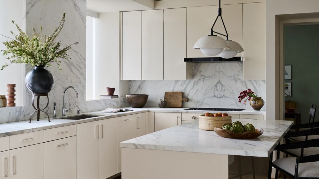
Everyone knows the quintessential Las Vegas style: From outfits to cars to casinos, it’s all about glitzy opulence. Outside the card rooms and cocktail bars, this more-is-more ethos has crept into home design—especially the condo complexes built in the 1990s and 2000s, when the city was one of the fastest-growing in the United States. For Chris and Kim, a young couple who love Vegas but not its ubiquitously extravagant interiors, renovating their 3,000-square-foot condo to fit a more minimal aesthetic took vision, restraint—and the right interior designer.
“There’s a dominant decor style here that Chris and I call ‘Casino Bathroom,’” says Kim, who is originally from Chicago and works for a nonprofit organization. “We didn’t want that over-the-top, gold-and-marble look.”
“We both work at home, so we placed a premium on minimalism,” Chris continues. “The less stuff we have, and the less potential for clutter, the better. A lot of what drives what we like about the homes we’ve lived in stems from the art we’ve collected and how everything else reacts to or works with the art, whether that’s from a physical perspective or an energy perspective.”
Interior designer Daniella Villamil, with whom the couple collaborated on a previous home, understood this approach and the importance of incorporating the couple’s paintings and prints into the project. “I come from a family of artists, so Chris and Kim’s directive to center the design on art and color spoke to me,” she says.
Kim found Villamil online and was drawn to her contemporary style, which is sophisticated with a playful edge. When the couple first saw the listing for their current residence—a condo just off the strip with prominent views of the Sphere, the Observation Wheel, and the desert mountains beyond—it was fully done up in the Old Vegas style they hoped to avoid. “The building has a lot of traditional details,” Villamil says. “The condo was very outdated. There were a lot of soffits, heavy ornate moldings, porcelain floors, and one of the bathrooms was red and black with a lot of crystals.”
The space needed work—Villamil took the interiors down to the studs—but the configuration stayed the same. “We couldn’t move any plumbing because it would have required us to go through the neighbors’ units,” she says. With the prescribed layout and selected art, the designer created a modern, color-forward home that balances furniture and decor with a particular eye toward scale. “They wanted to reuse as much furniture as possible, but with the decrease in square footage [from their past home], we couldn’t take a lot.”


