At first, designer Oliver Haslegrave wasn’t sure about the project brief. His clients, a Brooklyn family living in a three-level townhouse in Williamsburg, had two specific requests: First, they love to entertain so they wanted two kitchens (easy enough), and second, they asked that the upstairs feel like a French farmhouse and that the downstairs take inspiration from prewar New York hotels. Reframing the design challenge as an opportunity, Haslegrave, whose interiors firm Home Studios had focused solely on hospitality projects until they tackled their first residential project in 2020, started to think of ways to connect the disparate spaces.
“We worked with two very different narratives on two different floors,” Haslegrave says. “It was an unusual pairing but a welcome one. We wanted a thread that made you feel like they were related but in a way that still allows each to be true to its inspiration. We used color, material, and details, such as custom lighting and the Lacanche range to create that thread.”
When Haslegrave first saw the town house, it was outdated but nondescript (having undergone a renovation in the ’90s), and the owners wanted a complete gut remodel of all three floors, the courtyard, and an existing outbuilding in the yard. “We left the plumbing infrastructure,” the designer says, “so the bathrooms remained in place, as did the kitchen upstairs. The rest we took back to the studs.”
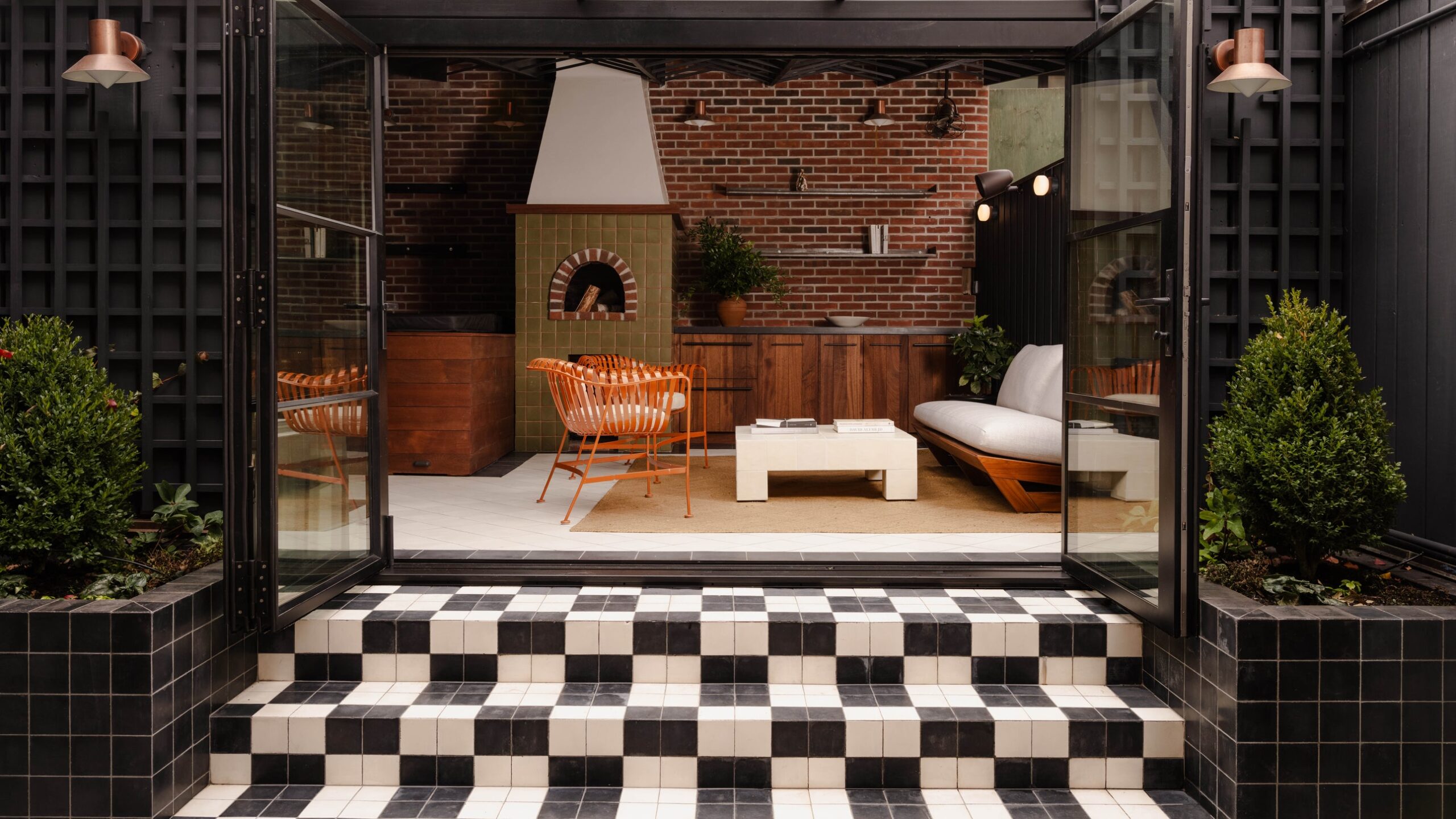
Working with the three levels—the family-centric spaces (kitchen, living and dining room, two bedrooms) are on the second floor, the entertaining areas are on the ground level, and the primary suite is in the partially below-ground cellar level—Haslegrave designed the 3,000-square-foot residence with the idea of gathering and retreat in mind. “As big entertainers, when they saw the downstairs, I think they recognized the potential to have it flow into the outbuilding,” Haslegrave says. “So, even though it’s separate from the main structure, we looked at it as an extension of the house.”
For the top level, the clients requested an aesthetic reflecting the calm elegance of a European farmhouse. This is a space where the family planned to gather for meals each day and spend time together in the evenings. Here, Haslegrave chose a simple palette of light wood, white walls, and antique tile, all underscored by reclaimed oak flooring. A mix of furniture from different eras—1970s dining chairs, an 18th-century hutch, contemporary lighting and fixtures—creates a cozy, lived-in vibe with a shades-of-blue through line. In the kitchen, Tri-Lox Antique White Oak cabinetry complements 19th-century Portuguese façade tile (originally used for building exteriors) and a custom-designed island built from painted wood, topped with zinc, and adorned with antique Victorian brass hardware. The kitchen is open to a dining room, positioned under a sizable skylight (Haslegrave installed new steel-and-glass windows and doors to the terrace to let in more light). Various 1970s dining chairs surround a wood farmhouse-style dining table, and the 18th-century painted wood hutch sits in juxtaposition to a Thomas Barger collectible design piece.


