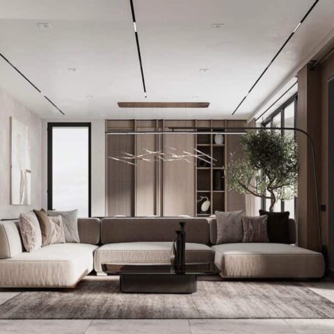
Pretty equals boring. Wrinkles in the bedcover are nothing to belabor. And there’s nothing like a dash of the untamed to enliven a buttoned-up space. These are a few of the philosophies of renowned interior stylist Mieke ten Have, whose interior magic-making frequently appears in AD, most recently in the lush Los Feliz home dreamed up by Reath Design in the July/August issue. Ahead of her debut monograph launching this fall, I caught up with the former magazine editor turned styling whiz to learn about her preferred methods of collaboration and what makes a great stylist today.
Designers often describe a research-based creative process—dissecting how the client will use the space, or gleaning the history of the property and the region. As a stylist, is your process similar?
It is in some ways, and it’s totally different in others. My concern is how do you best translate this space into a picture? I have more opportunity and more creative license because whatever I do for the picture isn’t necessarily how the family will actually live. On the flip side, the narrative [I’m building] is about the house and the architecture as much as it is the inhabitants. It’s not about putting your point of view onto a place; it’s figuring out the most compelling point of view of that house.
Does the title you’re shooting for add another layer to that mix?
If a magazine is hiring me, I will take that point of view into account with styling. But a lot of times, it’s the client that’s hiring me directly. I always ask, where do you want this project to be published? And that will often determine the point of view that I take in styling. However, at the end of the day, it’s about telling the best story possible for the project.
How do you vet clients?
I only like to take projects where I feel like I can really be of service. There are certain instances where you look at [a space] and know it isn’t a fully executed project yet. Then there are projects that look amazing and I know that I can make them feel even more alive. It all comes down to the scouting photos.
What makes great scouting photos?
The best pictures are the more pulled-back shots where you can understand the whole room. The tight detail shots are less important—zeroing in on the millwork isn’t particularly helpful. I can tell enough from those pictures what the story of the project is and what needs to be added to it to be fully executed. Sometimes it’s more accessories, sometimes it’s having a bit more surprise in the space. I always find that having something unexpected goes a very long way in a room.
Yes, the anchovy, as I’ve heard you refer to it.
Exactly. That’s something [designer] Thomas Jayne said to me 10 years ago, and it’s still the perfect metaphor for it. I have an aversion to pretty: If things are too perfect—everything matches and is symmetrical and very pleasing to the eye—I lose interest. What makes for successful styling, and similarly what makes for a successful room, is an element of disruption.


