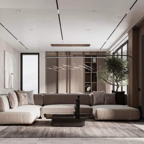
While many Americans associate London living with classic Regency and Georgian row houses or the Victorian Gothic Revival dwellings of the 19th century, the city’s modern side is just as compelling. Case in point: a young family’s recently finished home that occupies a new building in Mayfair, in collaboration with interior design by Sophie Ashby, the founder and creative director of Studio Ashby.
These particular clients likewise represent the contemporary, global side of the UK capital. Although they’re based in Hong Kong, the couple and their three children spend a portion of the year in London, and needed a pied-à-terre during their time in the city. Ashby set out to create a fresh look that matched the family’s youthful, well-traveled spirit. “The location and the overall space were a perfect fit for them,” says Ashby, who wanted to create an “interior language and materiality so the apartment could be more enticing by injecting some flair and personality to the space.” According to the designer, this gave the project a sense of freedom, with none of the restrictions around heritage listings or having to navigate the intricacies of historical architecture. “In effect, we had a blank canvas,” she says.
Ashby had worked with the client before on another property, and had gotten to understand their taste well—but most importantly, she understood the way they live. “As an antidote to the fast pace of their lives,” she explains, “this apartment was created to provide a sense of calm, relying on natural materials as well as some very special artworks.”
To that end, Ashby chose a base palette of neutrals that forms a restrained backdrop: pale oak floors, bleached poplar cabinets, walls painted in soothing shades of cream and putty, and plenty of marble that evokes a feeling of permanence. The open kitchen, with its polished yet substantial surfaces, is perhaps the best representation of the design thesis. As Ashby explains, “The kitchen was the most rewarding room to me. I’ve been wanting to work with bleached poplar burr for a long time, but hadn’t found the right project in which to use it before. I also love the carved oak island and feel like the two timbers work really beautifully together.”
The sense of tranquility is punched up by several striking works of art, with an emphasis on rising young talents including South African painters Anico Mostert and Lara Feldman, photographer Lily Bertrand-Webb, French textile designer Isabelle Hayman, printmaker Katherine Jones, and the Vienna-based mixed media artist Max Freund. Combined with a collection of vintage vases, books, crystals, and tribal sculptures, the overall aim, as Ashby explains, was “to showcase exciting, emerging artists from across the globe, incorporating a diverse range of works and objets d’art that balanced traditional and contemporary influence.”
Bespoke items that Ashby designed herself are in the mix, too, such as a games table in the living room, which has a rotating board (that allows you to play chess on one side and mahjong on the other). “While this apartment isn’t their primary residence, it was really important for the parents that the space supported the children’s passions and hobbies,” says Ashby. “There’s an upright piano, and the study and library offer lots of space to do crafts and illustration.”


