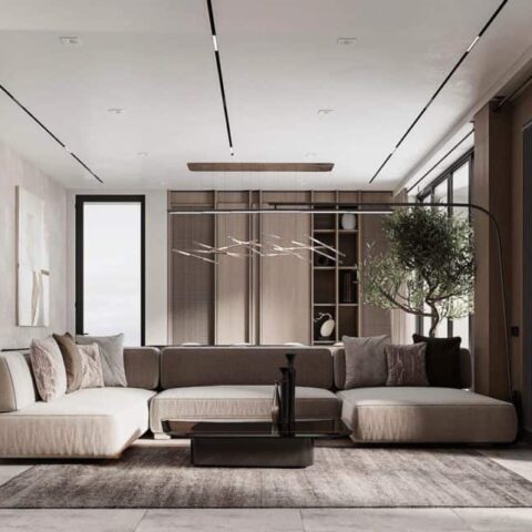
Hot chocolate. Negronis. Tap water. Not the usual jumping-off points for a high-end design project, but that’s exactly where Victoria Sass of AD PRO Directory firm Prospect Refuge Studio and her client, a young family of four humans and one dog, began. Never one to shy away from a theme, Sass knew that working with her client to assign a different drink to certain areas would help create the kind of delineated and specialized spaces the client wanted in the home.
And it wasn’t just the theme that was unconventional. Sass came onto this project after working with the client on another project—a beautiful home with an expansive and modern interior that never felt quite right. Sass and the owner were about to pull the trigger on the project when the owner toured, fell in love with, and purchased a 8,600-square-foot home in Minneapolis. “We just said [to Sass], ‘We would love to be in the house as soon as we possibly can now that we’ve made up our minds,’” the owner shares. “‘How do we make that happen?’”
With the clients gung-ho about a quick timeline, the project became a meeting of swift and efficient decision-makers. “This is the opposite of slow design, but I also think it was equally as organic because it wasn’t overthought, it wasn’t agonized over,” Sass shares. “We were really efficient in looking at all of our options, and making a functional, practical decision while trusting our gut.”
The designer used the theme of beverages to help create a home where each space had a separate identity but felt cohesive. It started by going room by room. “We went through her day and asked her to imagine herself in this room,” says Sass on an exercise she did with her client. “What time of day is it? What are you drinking in this room? Who is in this room?” From there, each room was assigned a drink that Sass used as an inspiration for the design. Fully aware that mentioning a theme can stir up visions of Trading Spaces–style disasters, the designer focused on the time of day, temperature, and color options that beverages conjured up for the client, rather than getting too literal.
When it came time to execute, Sass listened to the house as well, using limestone as a connective line, paying close attention to how the rooms transitioned, and repeating similar materials in different spaces. She created a one-of-a-kind kitchen by tapping artisan Jordan McDonald to craft custom hardware and working with an automotive company to get the right sheen on the cabinets. Things were made custom when they needed to be but, “Victoria’s not so head in the clouds that we’re buying a $90,000 bedside table that we’re not gonna actually be able to use,” the owner laughs. There were also the practical elements that a home with two young children requires. Oh, and then there’s the matter of Minnesota weather.
“We really wanted our house to feel good throughout all seasons. Bright and warm in the spring and the summer, cozy, intimate, welcoming, and inviting in the fall and winter. And so we took that into account with the textiles, the colors, the lighting, the whole kind of mood,” shares the owner. “And that ended up feeling really satisfying.”
Sass occasionally found herself collaborating with the tradespeople and contractors in the moment given the tight timeline, which helped draw out new ideas and concepts that might not have been created if they were siloed from each other. But often, she had a strong vision for a room, building the ‘negroni room’ around a large rug and a complementary ceiling treatment, filling in the gaps with pieces and colors that helped the space flow with the rest of the home. For Sass, that sort of layering is part of her process. “It’s almost like a dream coming into focus. In a dream, there’s always something that’s really clear, and then everything around it is a little hazy. But if you start to ask questions you can bring that into focus. That’s how a room comes together.”


