It was only meant to be a temporary solution. When AD PRO Directory designer Rodney Lawrence was asked by longtime clients to renovate an Upper West Side property for their family of five, it was in the interest of timely comfort. “The couple purchased this apartment to live in as we worked on extensive renovations of their primary residence,” he says. “The original plan was to do a quick facelift.”
The owners, who work in the biotech industry, met Lawrence years ago as his career was getting underway. He appreciated that they remained in touch as he opened his namesake firm, Rodney Lawrence Inc., and believed that his skills continued to complement the couple’s style. Before this project, Lawrence would’ve described their palette as bold and colorful. But this apartment presented many unexpected twists.
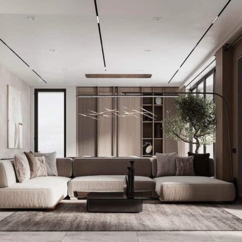
“This is a modern space, and from the beginning, we didn’t want it to have much color,” he says. “It’s a quintessential New York City tower apartment—in the sense that there’s so much natural light with beautiful views of the park and the surrounding buildings—so it made sense to do a calmer palette that was more about creating a mood.”
It all began in 2019, when the walls of this new construction building were still open and Lawrence could personalize a few of the decisions. “Most of the architectural work we did focused on keeping things simple, like removing soffits and upgrading the millwork,” he says. “Because we knew that the design was going to be about textures, our mantra was ‘light and bright.’” A fluid central staircase separates the five bedrooms and bathrooms from the common areas of the home, which spans 6,000 square feet near the building’s tallest point. And while walls of windows provide expansive vistas of the city, the private 1,500-square-foot terrace offers alfresco views of the buzz below.
“The goal was to create a gentle atmosphere,” Lawrence says. “All of the rooms have been wallpapered, and most of them are covered in a pattern that resembles travertine. The windows are cased in bronze, and that metal reappears throughout. Everything is intentional, and everything has movement.”
The designer describes how the monochromatic palette feels cohesive because it belongs to the same forgiving spectrum. Instead of using true blacks and whites, he pulled from middle creams and grays, warming and cooling them with different shapes and textures. Sharper colors appear in soft pops or smooth gradients, like the yellow artwork in the living room or the blue ombre wallpaper in a guest bedroom, so no component feels too out of place. These sensibilities continue up on the terrace, where a pergola shades a serene outdoor living area punctuated by bespoke latticework and planters overflowing with coordinating blooms.
“We all fell in love with something that wasn’t supposed to take up time, but then once we let go of that mindset, we had so much fun taking things slow and delving into every last detail together,” the designer says. “I think I even helped pick out the silverware.”


