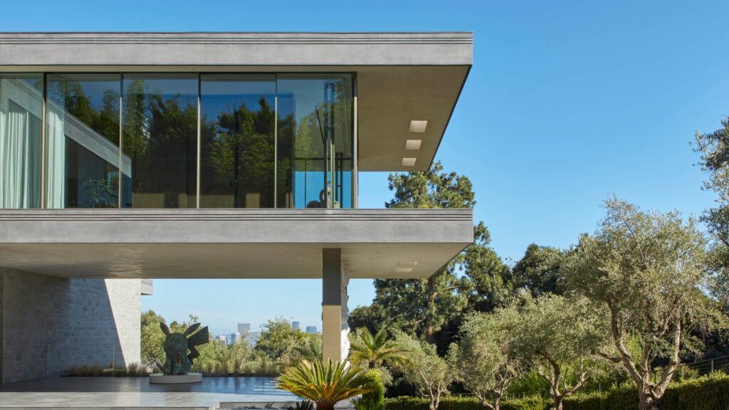
Moody visuals from Blade Runner, the 1982 sci-fi noir depicting a dystopian 2019 Los Angeles, were among the inspirations guiding AD100 talent Bryan O’Sullivan’s design of a Bel Air manse. In their brief, the clients, financier Adam Levinson and his wife, Brittany, noted that the film encapsulated their eclectic tastes; O’Sullivan, founder of his eponymous London and New York studio and author of the forthcoming A New Glamour from Rizzoli, fittingly responded with cinematic interiors. The Levinsons, he points out, “are not afraid of color and like metallic finishes, which sit quite nicely with the architecture. It was a blank canvas.”
After snagging the 30,000-square-foot, midcentury-redolent new-build developed by Bulli, Plus Development, and PC Construction, the couple, although smitten with the sprawling layout, craved a more intimate atmosphere in which to raise their three children, and turned to O’Sullivan and his team to enliven the rooms with warm, tactile layers.
The designer reimagined the vast spaces as more human-scale ones by employing a series of small interventions. Consider the archway, a grand arrival just past the exterior’s Daniel Arsham Pikachu sculpture and ceramic artist Tony Marsh’s pillars, heightened by a melding of burl walnut veneer, Calacatta Viola marble, and silver leaf. This art-filled “decompression zone,” as O’Sullivan puts it, was not part of the previous layout, but now gives visitors a chance to pause underneath Neal Feay’s shimmering aluminum portal before plunging deeper into the three-story residence.
Throughout, O’Sullivan showcases artworks from the Levinsons’ astonishing collection, built alongside advisor Joe Sheftel—including a Tracey Emin neon creation, Theaster Gates fire hose tapestry, and Josef Albers painting—forging a soulful, deeply personal narrative in the process.
“Our vision was to unify the existing structure with our family’s rhythm and lifestyle,” explains Brittany Levinson of the project. “We have a real love for art and wanted it to be central to the design of our home. One of the things that drew us to this house so much was the gallery-like feel of the double-height entry.”
The walls, wrapped in earthy Clayworks clay plasters, also provide continuity. The existing stone cladding was eradicated to make way for this textured alternative, just as the wood shutters were replaced with chic metallic screens and partition walls were installed to elicit an inviting sense of privacy. “It was cavernous before,” says O’Sullivan.
Swaths of automotive paint add a lustrous sheen, while the austere spiral staircase was revamped for a softer look. “It was black,” remembers O’Sullivan, “and we went for powder blue, so it’s more approachable. We also added timber capping to the glass balustrade to make it more homely.”
This element is one of Adam Levinson’s favorites too. “It brought an organic sensitivity of nature into a geometric and large, open space,” he says. “You literally feel yourself floating in a hilltop above Los Angeles with the floor-to-ceiling glass in front of you,” he says.
All rooms exude an air of elegance, yet are equally comfortable. Despite the presence of vintage items, the living room, with its curvilinear sofas and ensemble of tables, conjures a futuristic aura. It looks onto the swimming pool, with double-width, throne-reminiscent daybeds designed by Bryan O’Sullivan Studio, and mighty views.
Flowing from the kitchen and the family room is the informal dining area, which showcases the Harvest table from O’Sullivan’s inaugural furniture collection, a version inlaid with bespoke urban images—a skateboarder, a cop car, a donut—that evoke Los Angeles.
Upstairs, where the bedrooms are, the den contrasts the ground floor’s open-plan rooms. Dubbed the Pajama Lounge, it’s outfitted with oak paneling and a marble fireplace and has a cozy ambiance that also pervades the lower level.
Tapping into his expertise in the hospitality realm, here O’Sullivan crafted a red- and pink-toned bar and dimly lit speakeasy-style lounge enveloped in murals, both of which call to mind swank hotel lobbies. A full-fledged entertaining hub, there’s also a powder room graced by an Amani Lewis collage and a cinema complemented by whimsical concession cabinets, well-stocked with jars of candy for savoring alongside movies.
“It was a huge basement with no natural light,” recalls O’Sullivan. “We had to make it a place that people are going to want to spend time in.” Perhaps a place for the Levinsons to watch Blade Runner, and reflect on their design vision come to life.

