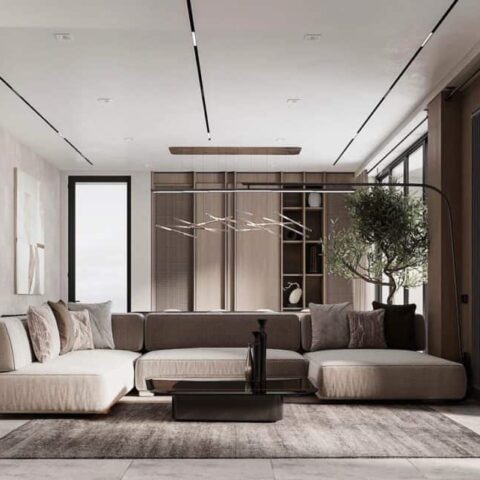
“I’m the ashtray guy,” Eric Wink jokes after detailing the numerous vintage examples that are peppered like Easter eggs in his very first front-to-back interior design project. A design fiend since his art history undergrad days, Eric started building up a private collection of vintage objets after he joined interior design studio Gachot as a brand director. Eventually, friends who saw his apartment began reaching out to ask him to rethink their space. Now, Eric has his very own practice that he’s helmed for nearly two years.
“A big part of my practice is, one, not to [imitate the aesthetic of] any era…,” Eric says, though Space Age and French Deco always serve as inspiration for his work. “They both have this slickness and reverence for a minimalist sort of design ethos, with a sense of individuality that avoids the spare coldness of true minimalism.”
He got to reference these eras in a new way when he designed a pair of apartments in tandem for two friends living in the same building in the West Village. “Both of these clients were really interested in exploring how to create spaces that felt masculine but not in obvious ways,” Eric says. He accomplished this through collecting pieces over time and seeing how each item informed the next. The result is two homes that feel distinct to each client’s personality.
“Everything is like a reaction to the thing we found before because it was this slow process of collecting things over time. There was a lot of one thing begetting another,” Eric says.
The first tenant is one that Eric describes as a “young, highly social” tech and entertainment executive who’s the ringleader of his friend group. He was moving into his own apartment for the very first time and felt like the one-bed, one-bath flat would form the perfect nexus point between friends living uptown and others based in Brooklyn. Despite being a fixer-upper (the warped floors needed to be refinished and an antechamber was eventually carved out between the main rooms to give each space some breathing room), “The client wanted a ‘party palace,’ but also a home that could be a respite from a fast life and hectic city,” Eric says of the historic ’60s apartment


